Historically Accurate: A new take on an old front porch
/It often happens that clients have historic homes that have been marred by bad construction over the years, and they come to us to help remedy the situation and restore the homes to their original splendor.
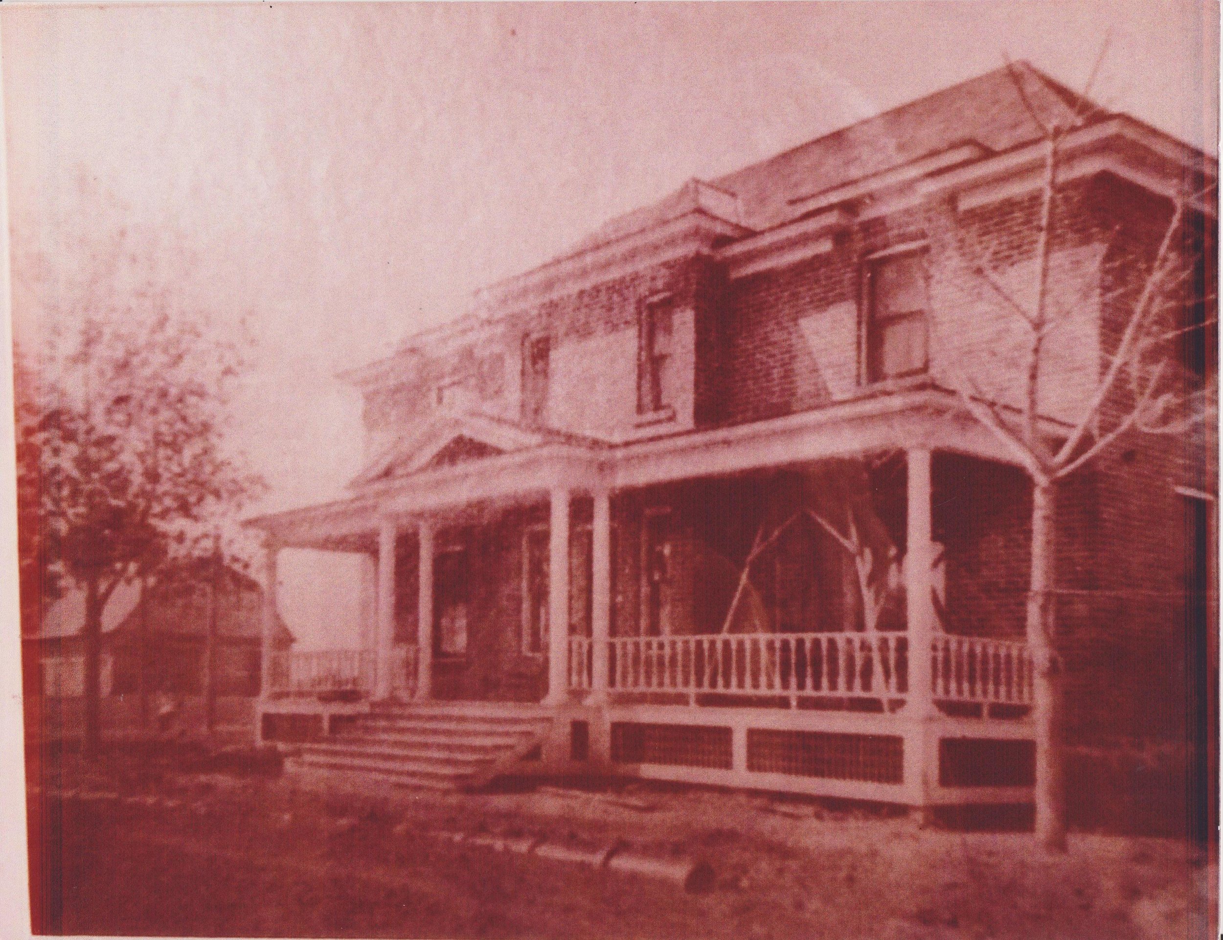
Such was the case for this historic house in Montana, a small project that was a favor for a friend of the business. The saga goes that the house originally was equipped with a beautiful, expansive front porch that was a combination of a central pediment along with flat-roofed flanking porches. You can see the original in the photograph below.
Later, somebody decided that the cold wintry winds of Montana were just too intense to be able to enjoy the open porch, and they tore it off and replaced it with this:
Yikes! That looks pretty rough. At least they got the door in the middle. And they put in a good foundation with a slab floor - perfect for our use.
So the project is to tear-off everything of the 'new' porch from the slab up, then recreate an enclosed porch. Somehow the columns were saved all these years, so we can reuse the actual original columns. But the question is - how to design a porch that looks like it could have / should have gone with the original home?
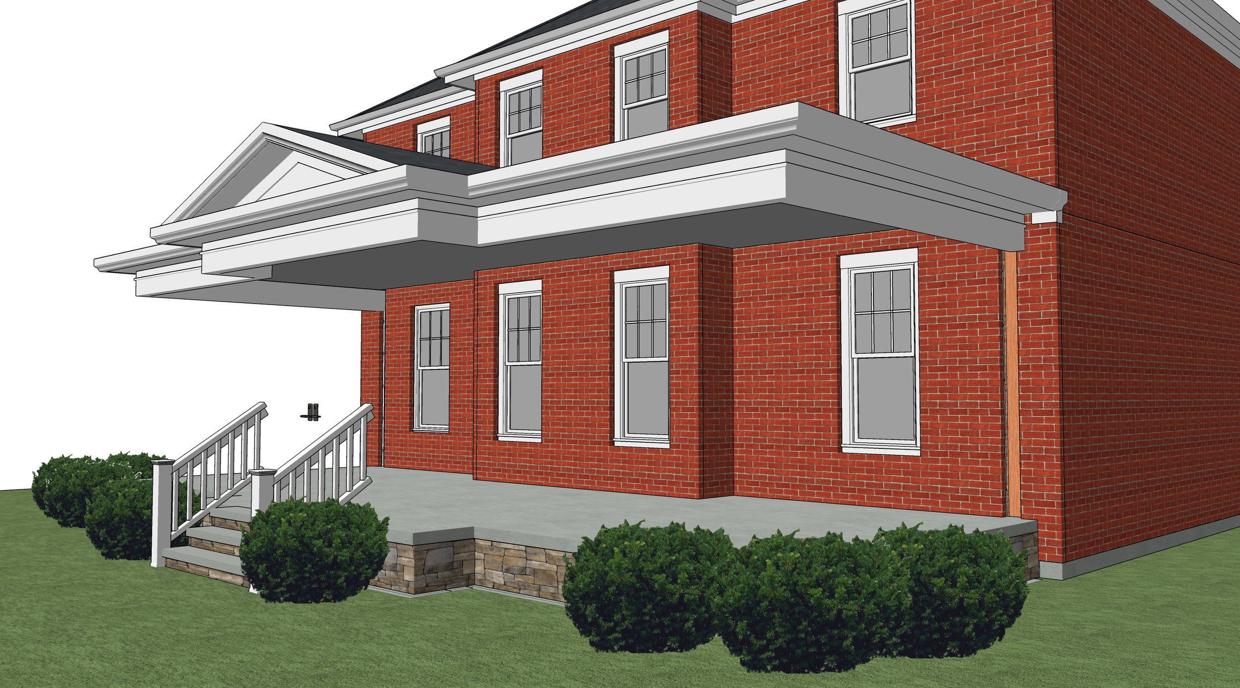
For that, we must do a few things. First, using he rules of classical proportioning based on the size of the columns and the millwork on the existing house, we can size the beam, overhang, soffit, and all the trim relating to the cornice. The central pediment is also based on these rules - so quite readily we can understand how everything from the top of the columns on up need to be designed.
cornice + foundation set - foundation outline is determined by existing porch (reuse foundation + slab). don't be alarmed by the floating roof!
The bottom is currently naked cinder-block - so we'll find a good stone veneer that is indicative of the region and use it to cover the foundation.
Now we have only to fill-in between the posts. Noticing the proportion of the windows in the house, we see they are vertical windows with vertical proportions, so we start there with beginning to understand what windows go in. Also, in the original picture we can see that the railing is a bit lower than the typical (more recent) 36" high rail.
Do we recreate a railing on the bottom? The client requested this - but it seems an unnecessary expense. Instead, we will use historically accurate paneling below the windows, with recessed flat panels and rails that align with the window mullions above. Easy to build, historically accurate, beautiful in their subtleness - they provide a base for the porch that is supportive, protective, but not overprotective.
We'll draw attention to the front door by using wider moulding between it and the flanking windows, use a wood door that compliments the red brick of the home, reduce the window size at the door by keeping the same window proportion but slimming it down by exactly 1/3, and including some structural plantings to tie the structure to the landscape.
new enclosed porch done in historically accurate vocabulary
So there you go - now there was much more geometry, proportioning, and review that helped drive this project along - but when we follow some basic rules of thumb, and respect the language of the original home, it's possible to design something that not just restores former beauty, but can expands it to a new level.
Hope you enjoyed! As usual - if you're interested in finding out more about how we might be able to help on your project, use the form in the sidebar to let us know. Thanks! Kyle.


