Uplands Remodel Reveal

Today we’re revealing the photos from a full service interiors project-the Uplands remodel in Ann Arbor. We teased this one earlier this year, but we’re back with a full breakdown of the transformation after patiently awaiting furniture delays that we’ve all been experiencing! As a reminder, we had some beautiful vaulted ceilings to work with, but the existing layout was extremely limiting with a galley kitchen bisecting the space right down the middle, creating three separate and closed off spaces. You can look back here for some existing images, and take a look at the existing floor plan below.

existing plan 2.jpg

By demolishing the entire existing kitchen and opening the whole floor up, we were able to work from a blank slate and create an entirely new way of living for this fun and energetic young family.

Our client gravitated towards a modern traditional design aesthetic. We started with a clean white palette throughout and repeated wood, gold, and black finishes in each space to help tie the large open concept all together.

In the kitchen, we used dark custom colored cabinetry for both of the impressive double islands to help ground the vaulted space. Gold light fixtures and hardware add a softness to the space, as well as the beautiful white oak floors throughout. A step in pantry gave our client offers much needed food storage, and the new 36” Thermador range with custom hood was ideal for cooking and entertaining.

In the dining area, we used wood cabinetry, custom designed metal shelving, and an amazing honed granite backsplash to create impact, which is also visible upon entry to the home. A beverage fridge and Kegerator makes this the perfect spot for entertaining guests upon arrival, and the beautiful gold chandelier adds the necessary layer of softness to the space.

In the living room, we selected furniture pieces that bring lots of texture to the space, helping all of that beautiful crisp white on the walls and ceiling to feel inviting rather than stark. We remodeled the fireplace using large scale, extremely thin tile (there’s only three tiles used!) in a dark charcoal color that again helps ground the space and repeat the use of dark vs light throughout. Gold light fixtures on the renovated stairway adjacent bring that oh so important softness full circle.

Photo Sep 28, 9 49 24 AM.jpg
Photo Sep 28, 9 30 47 AM.jpg

Thank you to our wonderful clients for trusting us with your home, and thank you for Momentum Construction for bringing the design to life!

Kit Houses - Right Home Company - Small 'Shotgun' Home Design in Grand Rapids, Michigan

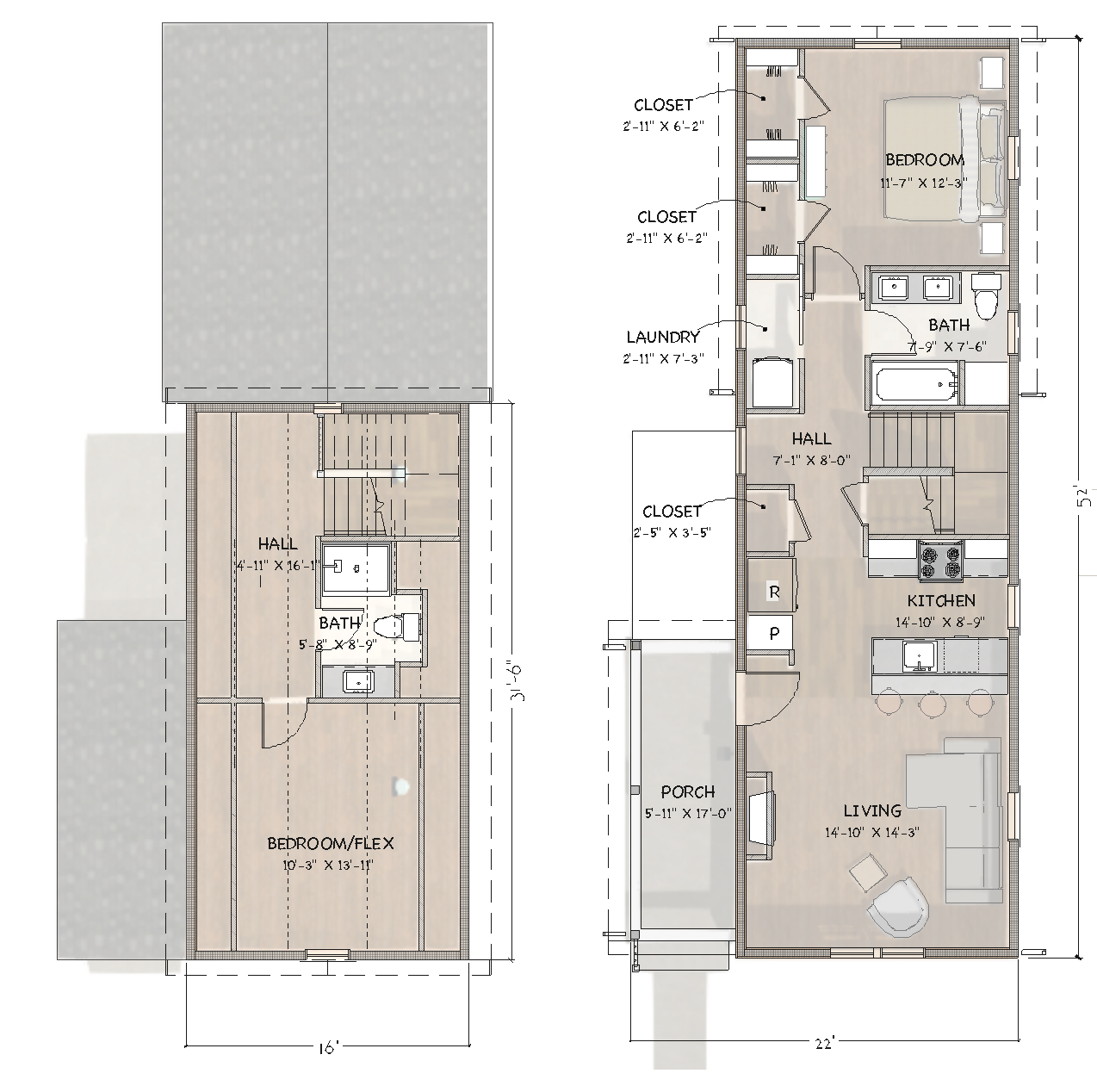
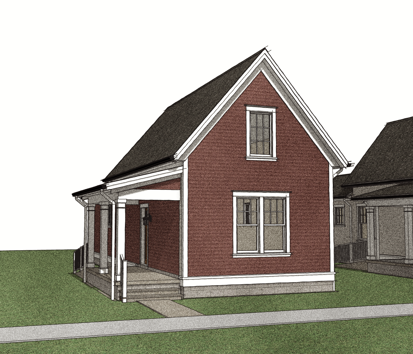
We teamed up with Chelsea’s Right Home Company recently for the ‘small home’ market with this adaptation of a ‘shotgun’ style house.

THe Right Home Company Shotgun House

THe Right Home Company Shotgun House

Screen Shot 2021-04-20 at 7.01.04 AM.png

They’re developing the kit for the Grand Rapids market, where there are many open city lots awaiting reconstruction. But their plan is to offer the house to a wider audience - and why not? With just over 830sf on the first floor, and 500sf on the second floor - the house is designed to be an efficient way for folks to build a new home while keeping an eye on budget.

Screen Shot 2021-03-16 at 7.49.20 PM.png

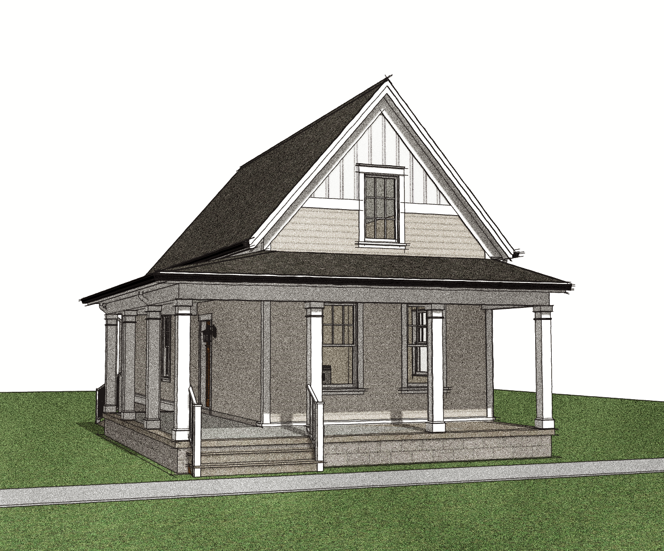
There are also options to the design - with the idea to create some flexibility and diversity among the designs while still keeping the basic building form. These include a taller wall which gives a bit more room upstairs, a full wrap front porch, a dedicated entry vestibule for a bit more room at the entry, a bay window on the front of the home for some architectural interest, and different siding choices and designs.

RHC Shotgun - The Lineup.png
The Original RHC Shotgun

The Original RHC Shotgun

The Original RHC Shotgun with Wrap-around Porch

The Original RHC Shotgun with Wrap-around Porch

The ‘Tall Wall’ RHC Shotgun with Bay Window, Entry Vestibule, and Hipped-Roof Porch

The ‘Tall Wall’ RHC Shotgun with Bay Window, Entry Vestibule, and Hipped-Roof Porch

The ‘Tall Wall’ RHC Shotgun with Wrap-Around Porch and Entry Vestibule

The ‘Tall Wall’ RHC Shotgun with Wrap-Around Porch and Entry Vestibule

On the Boards - New House in Downtown Chelsea

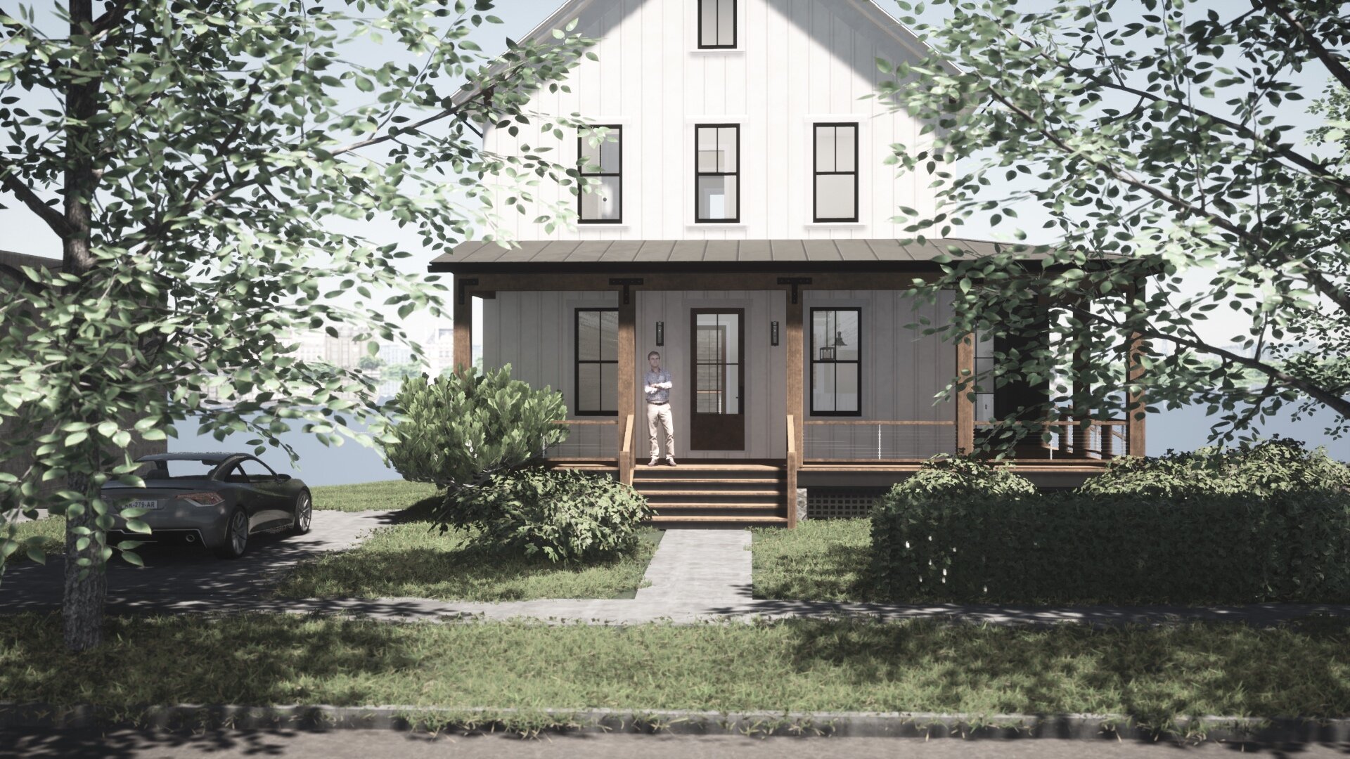
It’s always a pleasure to design a house for one of the beautiful traditional downtowns in our area - this one happens to be a corner property in Chelsea - a replacement for a house which unfortunately caught fire a few years back and was too badly damaged to be repaired.

The solution? A new home, designed to historical standards but with a modern twist - working with the owner, we were able to design a house which includes a ‘historical core’ and what appears to be a later addition - in this instance denoted by the change in materials and details.

The idea is that the original house - shown in white - was latter added onto with a kitchen and wrap-around porch. The details on the ‘original house’ are decidedly traditional, with proper cornice detailing, an upright, simple shape, and a traditional batten siding. The addition would have a horizontal emphasis thanks to the wrapping porch, and make use of rough timbers and exposed metal bracketing to achieve a distinctive look.

New+Traditional+House+-+Chelsea+MI+-+Front+View
New+Traditional+House+-+Chelsea+MI+-+Corner+View
New Traditional House - Chelsea MI - Side View

Of particular interest is the coordination of the walkout basement (under the deck) and the bedroom egress windows in the basement - to make this transition we’ve used a sunken courtyard at the side of the house - shown here without the protective hedge that will block it from view (so you can see how it’s achieved).

Image6.jpg

More to come…

On the Boards - UPLANDS REMODEL - Scio Township, MI - Spring 2021

Today we’re excited to share a peek at an interior remodel project that will be kicking off with Momentum Construction next month. Our client is a young family of five, and their current closed off floor plan configuration is just not conducive to the way they live. A narrow galley kitchen bisects the vaulted great room, creating three small, underperforming spaces. It also blocks the beautiful view out the rear glass sliding doors and full height windows, making the space feel darker and less impressive than it could. Take a look at some before photos below to see where we’re starting from.

We were immediately excited about all the potential of this space with those gorgeous vaulted ceilings and natural light (that was there, it was just being blocked!) With our client’s Pinterest board in hand and some creative solutions of our own, we used the following images as inspiration for the main level’s new dining, kitchen, and living room.

By moving the dining room into the front of the home, using double islands that span the central spacious kitchen, and building out the fireplace wall in the rear living room, we were actually able to create more defined living zones than the previous closed in floor plan did. Capitalizing on the scenic view in the backyard, the rooms now flow easily from the front entry to the rear deck, creating the perfect home for entertaining and enjoying time together as a family.

The palette will be a mixture of modern traditional with touches of gold and texture to keep the bright new space warm and inviting. We’re so excited to see this come together, stay tuned for more from this Uplands project!

Lorden FFE Mockup.jpg

Dive deeper: See The film “Why Beauty Matters”


The Late great roger scruton

The Late great roger scruton

A while back, I became acquainted with the work of British writer and philosopher Roger Scruton.

I have since discovered his vast body of work covering the traditional arts including Architecture, Art, and Music - and it’s given me many tools and techniques for understanding and interpreting these in a much richer way than I had before. As a result, I’ve noticed a marked improvement in the quality of my design work and even a change in the way I approach design in general.

Whether you went through art school (especially if you did, actually) or just want to have some solid ground under you when evaluating, interpreting, and discussing Art and Architecture, this is video absolutely the best place to start.

If you’re short on time, watch the intro then skip ahead to about 20:00 to see the part about Architecture - you can always come back to watch the rest. Enjoy!

- KJM

My Letter to This Old House re: Window Placement

From an email sent earlier today - usually I wouldn’t bother to write a letter like this but the article was the top hit on google - meaning that many people are being exposed to this terrible advice:

Dear This Old House Editors:

Just found your ‘Planning Window Placement’ article on the website: https://www.thisoldhouse.com/windows/21015390/planning-window-placement

I was dismayed at how cavalier the author was in his suggestions for window placement, especially for a magazine theoretically devoted to Old Houses and Traditional Design. It provides no real useful information, and in fact provides several terrible suggestions to the unsuspecting and untrained person of honest intent. For example:

1. "Don't Be Bound by Tradition” The first suggestion essentially is to throw-out centuries of good design practice in favor of what ‘feels good’ - by committing the fallacy that all window design was based on a purely functional necessity, instead of based on a balance between beauty/aesthetics and function. Additionally, different architectural styles demand different window designs, sizes, alignments and rhythms in order to achieve the desired architectural effect. This ‘First Rule’ is not a rule at all, but a repudiation of all rules and a license to create the kind of kitch and hodge-pode ‘architecture’ we see all around us today.

2. "The Front Doesn't Have to Determine All the Other Sides” - perhaps not, but it should set the tone for the house - and since homes these days often stand apart from their neighbors, instead of closely packed as in the villages of old, the sides should be consistent - or at least coherent - with the patterns and tone set by the front. The author at least admits that things can be ‘wrong’ - though it is put in scare quotes and no visual examples are offered.

3. “Keep Comfort in Mind” - this is another seemingly reasonable suggestion, but presented in a reckless way which really offers no real practical guidelines.

I could go on about the shortcomings of this article but I’m already spending too much time on it. My suggestion is to revisit the topic with a whole series of articles, as window design and alignment is a very rich topic and is often badly botched. You can start with reviewing the information in Get Your House Right, an excellent book that will serve as a jumping off point. Follow-up with discussing the historical details as laid out by the oldhouseguy.com series on windows.

If I saw well-written articles like this I’d be happy to renew my membership. You have a large platform and you do great work - why not do some in-depth design articles discussing the characteristics of ‘old house’ elements? I’m sure your readers - and those who have to live with the houses they design - would greatly benefit from it.

Thank you!

Kyle J. Marsh

Calming the Crazy Windows

Just finishing up with window ordering for a client who hired me to review and finalize the design of the exterior of their home, a new build, in Boyne City. First I redesigned the front windows, roofline, trim package and column design - now we’re around to the side of the house.

Usually I wouldn’t worry as much about the side if it were in a compact neighborhood, but the fact that the windows/trim and siding have such a high contrast means that they will be very visible - and any strange or weird designs will telegraph through. Additionally, it is a house that has no surrounding structures - and a road which at one point makes this side very visible.

First, the Interiors people really took them for a ride on their proposed ‘edit’ to my original design - here’s what they sent:

Scannable Document on Oct 3, 2019 at 4-04-14 PM.png

However, when I plugged that into the actual floor plan, and where the windows were shown on their drawings, this is the unhappy result - a hodge-podge of mismatched and misproportioned windows.

Not quite right

Not quite right

So, like I always do - I wanted to get this house right.

How to do it?

1 - Limit Window Size Variations

Well we start by limiting our window ‘pallette’ to just a few sizes. No more than 2, possibly 3 per side.better

So I widened the windows in the bedrooms, I made the lower level windows match each other, and I turned the double upstairs to a single.

2 - Line Things Up

Then, we line things up - after looking at the floor plan I found that the window arrangement in the rooms was somewhat arbitrary, except for the front bedrooms which had windows on each side of the beds.

Also, I asked if we needed that double window upstairs, which is behind the tub. To me, that was overkill - a 6’ by 6’ window facing a fairly public road - may be better to do a single window there for privacy reasons, centered above the tub. That still gives a 3’ wide window, which lets in plenty of light and view.

3 - Even Spacing

I also wanted pretty consistent spacing. Finally, I created a ‘grouping’ using the smaller windows on either side of the double window in the room below (which they would not let me change to a single no matter how hard I asked).

Much better

Much better

As you can see, it takes a bit of finesse and push/pull to get things right - a bit of guess and check sometimes - but as long as you keep the compositional rules in mind it’s really not that difficult to achieve a result that looks great both from the inside, and the out. Problem is, most designers either don’t care to do it, or they don’t know what the rules are in the first place. They may not even know there ARE rules of thumb!

Ok back to work -

Kyle

Before + After - Boyne City - Wrap-Around Deck

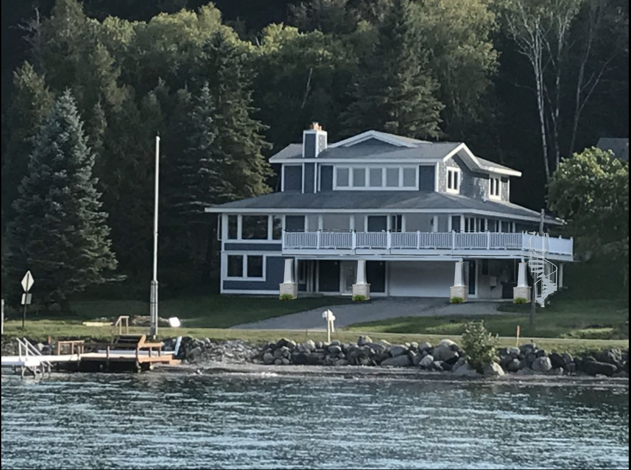
Needed a quick visual on a wrap-around deck for a lake house on Lake Charlevoix - turned to Photoshop to see if I could do something just to give the basic idea and convey the design I thought was appropriate.

It’s rough, but not bad for basically a quick conceptual design.

Certainly gives it some curb appeal!

Before

Before

After- with new wrap-around deck

After- with new wrap-around deck

One rule of thumb for designing window panes / grilles (aka muntin bars)

Today I’m working on a remodel project here in downtown Dexter for a great local couple, Harry and Ella Rolfes who are remodeling a house they’ve owned as a rental for years but have decided to renovate into their own downtown home.

The structure of the roof is too badly undersized and leaves little room upstairs, so we’re taking the rather bold step of removing it completely and replacing it with a full second story, complete with new truss roof.

Existing house w/ half story upstairs and bad roof

Existing house w/ half story upstairs and bad roof

Proposed house w/ full second floor and truss roof

Proposed house w/ full second floor and truss roof

As part of that we’ll also be incorporating a new window design into the building. Naturally, we’ll be incorporating Panes into the windows.

Why? To help soften the design, to give it life and presence, to incorporate rhythm and proportion, and to provide direction for the design of the size/shape of the windows themselves. From Get Your House Right, the following:

GYHR - Glazing Bars

So next was to pick the specific window - for this project, we’re using Pella. While going through the Pella literature I came across something I would consider a common error in Window Pane design. What’s shown here is their ‘Traditional Grille’ pattern - and I’ve stacked it up next to the window I’ll be using.

Before I go on - does that look correct to you? If that window was installed on your house, would you think it was beautiful? Would you think it was ugly? Would you know the difference?

Pella Windows - Traditional Grille Pattern from Brochure
Screen Shot 2019-07-25 at 8.46.23 AM.png
 
...the correct term for the ‘Grille’ is ‘Muntin Bar’, but around here the builders will look at you strange if you call them that, so I just bite my tongue and call them ‘Grilles’. You could call them ‘panes’ and it might be a good compromise word - maybe I’ll start doing that... I just feel silly calling them Grilles...
— KJM
 

Looking at the upper windows, if I took Pella’s suggested pattern the front of the house would look like this:

Screen Shot 2019-07-25 at 8.46.09 AM.png

Not bad. However, there’s still something they’re doing that makes them feel wrong. It’s something most people have no idea about, and it’s the easiest thing in the world you can do to make sure all your windows look cohesive + correct.

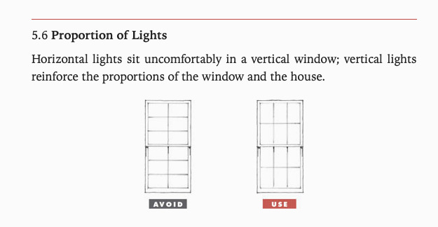
That is: Always use a vertical rectangle or a square when setting out your window panes. Never use a rectangle which is laying on its side.

Get Your House Right - 5.6 - Proportion of Lights

Applying that to the window design gives us a much more composed design that feels (and is) authentically considered.

Screen Shot 2019-07-25 at 9.29.56 AM.png

There are more nuanced rules for setting out the proportions, like matching them across floor levels and incorporating panes into different window types - but if you just remember this rule of thumb you’ll be 80% of the way there.

Remember:

WINDOW PANE RULE #1

Always use a vertical rectangle or a square when setting out your window panes.

Historically Accurate: A new take on an old front porch

It often happens that clients have historic homes that have been marred by bad construction over the years, and they come to us to help remedy the situation and restore the homes to their original splendor.

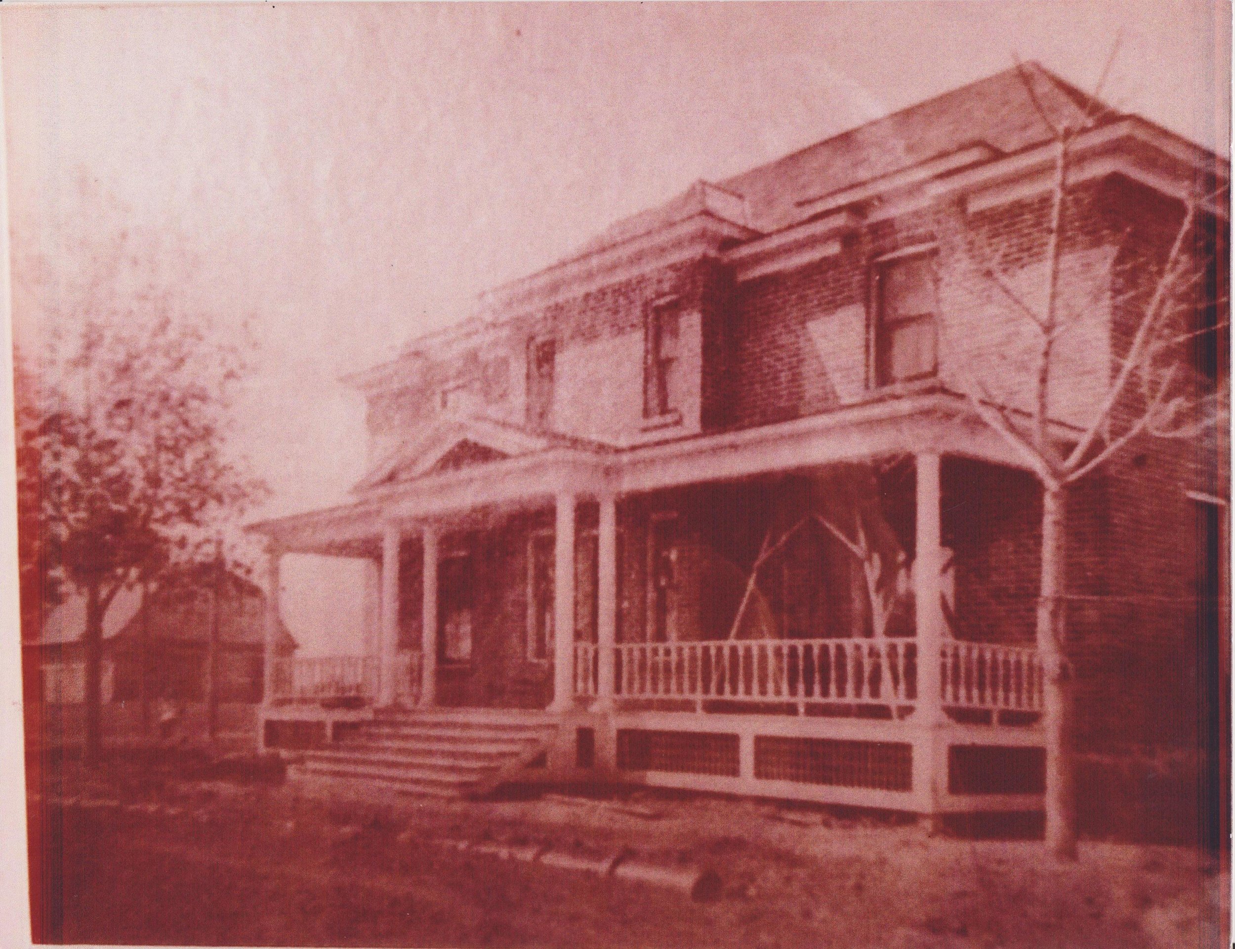
Such was the case for this historic house in Montana, a small project that was a favor for a friend of the business. The saga goes that the house originally was equipped with a beautiful, expansive front porch that was a combination of a central pediment along with flat-roofed flanking porches. You can see the original in the photograph below.

Later, somebody decided that the cold wintry winds of Montana were just too intense to be able to enjoy the open porch, and they tore it off and replaced it with this:

Yikes! That looks pretty rough. At least they got the door in the middle. And they put in a good foundation with a slab floor - perfect for our use.

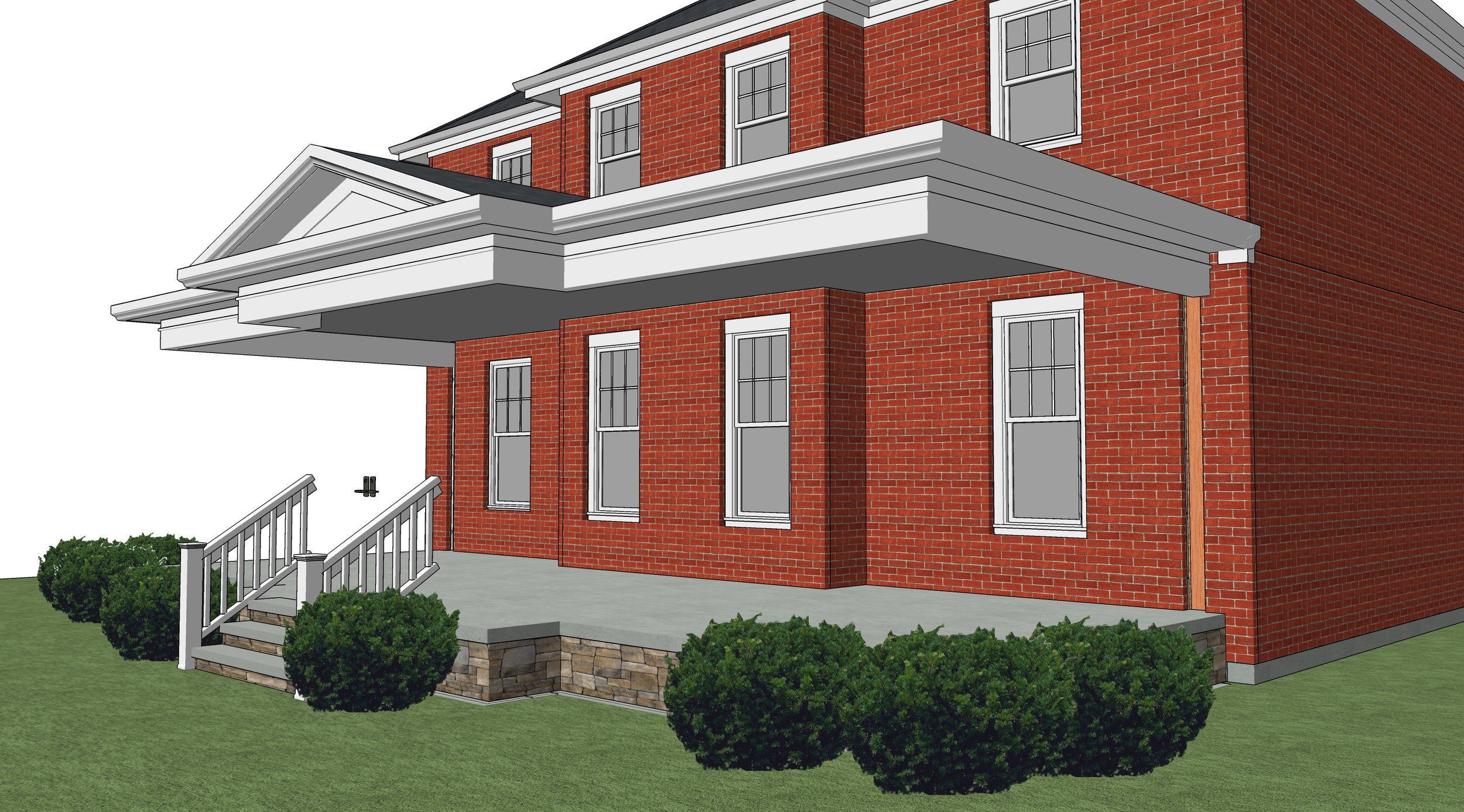
So the project is to tear-off everything of the 'new' porch from the slab up, then recreate an enclosed porch. Somehow the columns were saved all these years, so we can reuse the actual original columns. But the question is - how to design a porch that looks like it could have / should have gone with the original home?

For that, we must do a few things. First, using he rules of classical proportioning based on the size of the columns and the millwork on the existing house, we can size the beam, overhang, soffit, and all the trim relating to the cornice. The central pediment is also based on these rules - so quite readily we can understand how everything from the top of the columns on up need to be designed.

cornice  + foundation set - foundation outline is determined by existing porch (reuse foundation + slab). don't be alarmed by the floating roof!

cornice  + foundation set - foundation outline is determined by existing porch (reuse foundation + slab). don't be alarmed by the floating roof!

The bottom is currently naked cinder-block - so we'll find a good stone veneer that is indicative of the region and use it to cover the foundation. 

Now we have only to fill-in between the posts. Noticing the proportion of the windows in the house, we see they are vertical windows with vertical proportions, so we start there with beginning to understand what windows go in. Also, in the original picture we can see that the railing is a bit lower than the typical (more recent) 36" high rail.

Do we recreate a railing on the bottom? The client requested this - but it seems an unnecessary expense. Instead, we will use historically accurate paneling below the windows, with recessed flat panels and rails that align with the window mullions above. Easy to build, historically accurate, beautiful in their subtleness - they provide a base for the porch that is supportive, protective, but not overprotective. 

We'll draw attention to the front door by using wider moulding between it and the flanking windows, use a wood door that compliments the red brick of the home, reduce the window size at the door by keeping the same window proportion but slimming it down by exactly 1/3, and including some structural plantings to tie the structure to the landscape.

new enclosed porch done in historically accurate vocabulary

new enclosed porch done in historically accurate vocabulary

So there you go - now there was much more geometry, proportioning, and review that helped drive this project along - but when we follow some basic rules of thumb, and respect the language of the original home, it's possible to design something that not just restores former beauty, but can expands it to a new level.

Hope you enjoyed! As usual - if you're interested in finding out more about how we might be able to help on your project, use the form in the sidebar to let us know. Thanks! Kyle.

Remodeling: Reinforcing Joists for New Drain Lines

How we reinforced existing 2x10 floor joists to accommodate a new 3 1/2" drain

An issue that often arises when designing a remodeling project is the problem of adding or relocating the main toilet drainpipe for an upstairs bathroom. The problem is that when the house was built using 2x10 floor joists for the second level, a plumber cannot drill directly through the floor joists to route the drain - he must drop the pipe below the level of the ceiling. This creates all kinds of problems with needing soffits to hide the drainpipe, or reconfiguring the bathroom to allow for a more direct route.

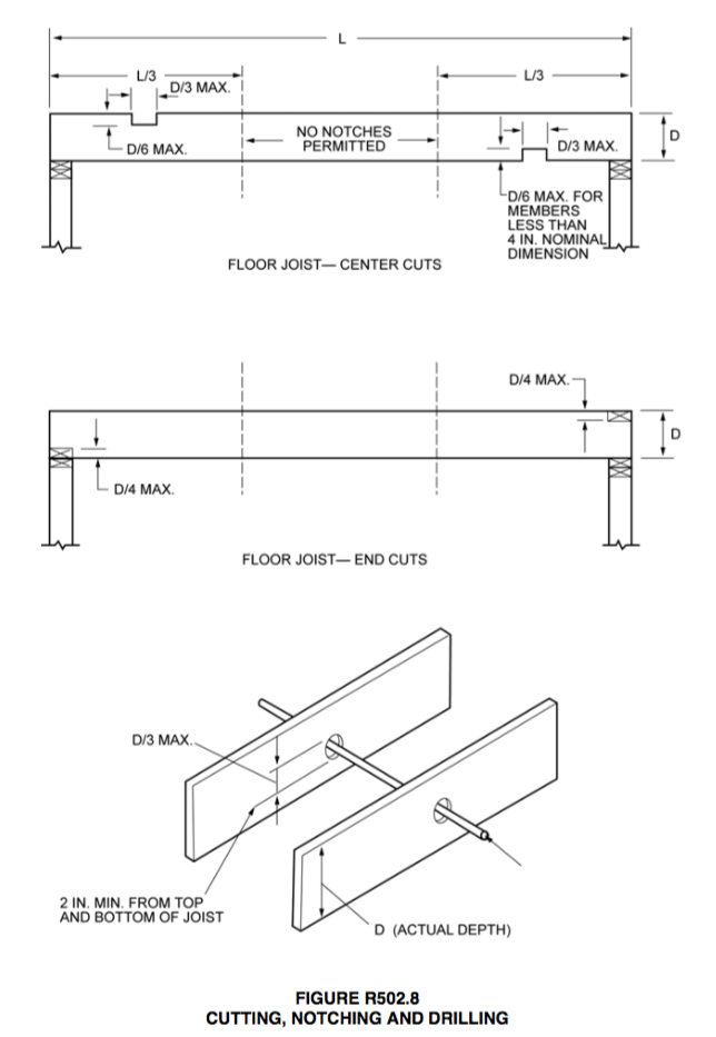
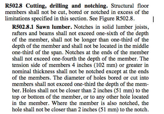
Why can't we drill through the joists you ask? Well the building code (I'm referencing the Michigan 2015 Residential Code, based off the IRC) stipulates that the size of the hole can be no larger than 1/3 the size of the "Actual" joist depth - and since a 2x10 is Actually 9 1/4" deep, the largest hole we can drill is just a hair over 3" diameter. 

Michigan Residential Code - Joist Cutting, Notching and Drilling
Michigan Residential Code - Joist Cutting, Drilling, and Notching (TEXT)


In the past, we've paid a structural engineer to do some calculations and draft a letter allowing us to 'sister' 3/4" plywood to each side of the joist where the hole is located, thereby allowing us to drill the 4" hole we needed to run the drain line.

The problem with this is that most structural engineers are already busy solving interesting and complex structural problems, and have a hard time taking the time to address small questions like this, not to mention taking on the risk for a fairly large structural risk that might pay them $150, plus require a drive to the site... etc. 

So you can imagine that not only is it a bit costly to bother an engineer with this situation, but it ends up taking some time for the approval. But until now, I thought it was the only way.

While searching around for a solution, I came upon a company called Metwood which produces a line of floor joist hole "Reinforcer™ Technologies", which attach directly to the side of the floor joist and are pre-engineered to distribute the joist load around the larger (up to 4") hole.

Metwood - Joist Hole Reinforcer.png

As the inspector will require engineering confirmation on a product like this, I called to verify that this type of official verification would be provided. The very helpful people at the company assured that this certification is delivered with each shipment - and would meet the requirements of the inspector. When the shipment arrives I'll be sure to upload this verification report to include with the blog post, along with installation photos.

 
Metwood - Joist Hole Reinforcer
 

You can check out Metwood on their website here - which include not only joist hole reinforcement, but notch reinforcement, I-Joist Web Reinforcement, and even I-Joist Flange Reinforcement.

Good Luck on the project!

Small-House Kitchen: Design Evolution

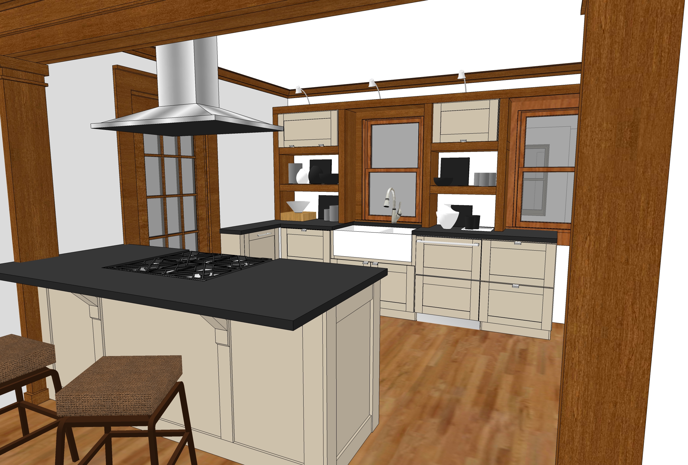
These last few days I've been finishing up the drawings for an interior remodel in Ann Arbor that includes opening up and completely redesigning the kitchen. The owner really likes the wood trim original to the home, so we'll be matching that with the cabinets and new trim pieces.

I've decided to post some of the renderings because I'm not usually a big fan of wood cabinets mixed with a wood floor - but in this case I like it! Take a look at how the design is evolving:

The first design with Painted cabinets and open shelving as part of the storage system. 

The first design with Painted cabinets and open shelving as part of the storage system. 

Updated design showing quarter sawn oak cabinets with full uppers. I tried using the new crown moulding to tie the upper cabinets together, and it seemed to be effective, but something was still missing...

Updated design showing quarter sawn oak cabinets with full uppers. I tried using the new crown moulding to tie the upper cabinets together, and it seemed to be effective, but something was still missing...

The addition of the backsplash really helps to tie the kitchen together. Note the splash extending just above the bottoms of the cabinets, to the trim band which carries around the room the line established by the window sash.

The addition of the backsplash really helps to tie the kitchen together. Note the splash extending just above the bottoms of the cabinets, to the trim band which carries around the room the line established by the window sash.